La propiedad align-content
Podemos controlar el alineamiento de los elementos de una caja flexible ( flexbox ) a lo largo de su eje principal con justify-content o a lo largo de su eje transversal con align-items.
Pero, a veces, los elementos de la caja flex pueden ocupar varias líneas ( vea flex-wrap ). En este caso podemos controlar el alineamiento de los elementos flex utilizando la propiedad align-content.
La propiedad align-content es una propiedad del contenedor flex y puede tomar una de estas valores:
.contenedor { align-content: flex-start | flex-end | center | space-between | space-around | stretch; }
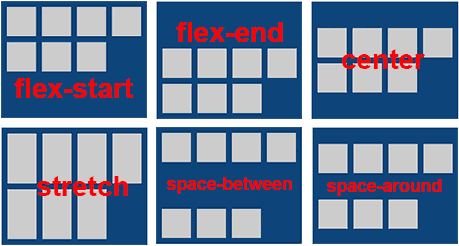
flex-start: los elementos aparecen agrupados al principio ( start ) del eje transversal.
flex-end: los elementos aparecen agrupados al final ( end ) del eje transversal.
center: los elementos aparecen agrupados al centro ( center ).
stretch ( el valor por defecto ): los elementos aparecen estirados ( stretched ) para ocupar el espacio restante.
space-between: los elementos aparecen distribuidos uniformemente: al principio, en el centro y al final del contenedor flex.
space-around: los elementos aparecen distribuidos uniformemente, y con un espacio igual entre ellos.
Para los usuarios de IE10
Para que los usuarios de IE10 tengan una experiencia similar utilizamos la propiedad –ms-flex-line-pack cuyos posibles valores son:
start ( en lugar de flex-start )
end ( en lugar de flex-end )
center
stretch
justify ( en lugar de space-between y  space-around )
align-content: flex-start
Si queremos que los elementos ( items ) aparezcan agrupados al principio ( start ) del eje transversal de la caja flex utilizamos align-content: flex-start;
.flex-container.flex-start{
	-webkit-align-content: flex-start;
	-ms-flex-line-pack: start;
	align-content: flex-start;
}
.flex-container{
	width: 250px;
	height:200px;
	padding:5px;
	margin: 10px auto;
	background-color:#124678;
	display:-webkit-flex;
	display: -ms-flexbox;
	display: flex;
	-webkit-flex-wrap: wrap;
	-ms-flex-wrap: wrap;
	flex-wrap: wrap;
}
.flex-item{
	display: inherit;
	width:50px;
	min-height:50px;
	background-color:#ccc;
	margin:5px;
}
.flex-item p{
	width:100%;
	text-align:center;
	-webkit-align-self: center;
	-ms-flex-item-align: center;
	align-self: center;
	margin:0;
	}

.flex-container.flex-start{
	-webkit-align-content: flex-start;
	-ms-flex-line-pack: start;
	align-content: flex-start;
}
   1
   2
   3
   4
   5
   6
   7
1
2
3
4
5
6
7
align-content: flex-start
Si queremos que los elementos ( items ) aparezcan agrupados al final ( end ) del eje transversal de la caja flex utilizamos align-content: flex-end;
.flex-container.flex-end{
	-webkit-align-content: flex-end;
	-ms-flex-line-pack: end;
	align-content: flex-end;
}
.flex-container{
	width: 250px;
	height:200px;
	padding:5px;
	margin: 10px auto;
	background-color:#124678;
	display:-webkit-flex;
	display: -ms-flexbox;
	display: flex;
	-webkit-flex-wrap: wrap;
	-ms-flex-wrap: wrap;
	flex-wrap: wrap;
}
.flex-item{
	display: inherit;
	width:50px;
	min-height:50px;
	background-color:#ccc;
	margin:5px;
}
.flex-item p{
	width:100%;
	text-align:center;
	-webkit-align-self: center;
	-ms-flex-item-align: center;
	align-self: center;
	margin:0;
	}

.flex-container.flex-end{
	-webkit-align-content: flex-end;
	-ms-flex-line-pack: end;
	align-content: flex-end;
}
   1
   2
   3
   4
   5
   6
   7
1
2
3
4
5
6
7
align-content: center
Si queremos que los elementos ( items ) aparezcan agrupados en el centro ( center ) de la caja flex utilizamos align-content: center;
.flex-container.center{
	-webkit-align-content: center;
	-ms-flex-line-pack: center;
	align-content: center;
}
.flex-container{
	width: 250px;
	height:200px;
	padding:5px;
	margin: 10px auto;
	background-color:#124678;
	display:-webkit-flex;
	display: -ms-flexbox;
	display: flex;
	-webkit-flex-wrap: wrap;
	-ms-flex-wrap: wrap;
	flex-wrap: wrap;
}
.flex-item{
	display: inherit;
	width:50px;
	min-height:50px;
	background-color:#ccc;
	margin:5px;
}
.flex-item p{
	width:100%;
	text-align:center;
	-webkit-align-self: center;
	-ms-flex-item-align: center;
	align-self: center;
	margin:0;
	}

.flex-container.center{
	-webkit-align-content: center;
	-ms-flex-line-pack: center;
	align-content: center;
}
   1
   2
   3
   4
   5
   6
   7
1
2
3
4
5
6
7
align-content: stretch
Si queremos que los elementos ( items ) de la caja flex aparezcan estirados ( stretched ) ocupando el espacio restante, utilizamos align-content: stretch;
.flex-container.stretch{
	-webkit-align-content: stretch;
	-ms-flex-line-pack: stretch;
	align-content: stretch;
}
.flex-container{
	width: 250px;
	height:200px;
	padding:5px;
	margin: 10px auto;
	background-color:#124678;
	display:-webkit-flex;
	display: -ms-flexbox;
	display: flex;
	-webkit-flex-wrap: wrap;
	-ms-flex-wrap: wrap;
	flex-wrap: wrap;
}
.flex-item{
	display: inherit;
	width:50px;
	min-height:50px;
	background-color:#ccc;
	margin:5px;
}
.flex-item p{
	width:100%;
	text-align:center;
	-webkit-align-self: center;
	-ms-flex-item-align: center;
	align-self: center;
	margin:0;
	}

.flex-container.stretch{
	-webkit-align-content: stretch;
	-ms-flex-line-pack: stretch;
	align-content: stretch;
}
   1
   2
   3
   4
   5
   6
   7
1
2
3
4
5
6
7
align-content: space-between
Si utilizamos align-content: space-between; los elementos ( items ) aparecen distribuidos uniformemente: al principio, en el centro y al final del contenedor flex.
.flex-container.space-between{
	-webkit-align-content: space-between;
	-ms-flex-line-pack: justify;
	align-content: space-between;
}
.flex-container{
	width: 250px;
	height:200px;
	padding:5px;
	margin: 10px auto;
	background-color:#124678;
	display:-webkit-flex;
	display: -ms-flexbox;
	display: flex;
	-webkit-flex-wrap: wrap;
	-ms-flex-wrap: wrap;
	flex-wrap: wrap;
}
.flex-item{
	display: inherit;
	width:50px;
	min-height:50px;
	background-color:#ccc;
	margin:5px;
}
.flex-item p{
	width:100%;
	text-align:center;
	-webkit-align-self: center;
	-ms-flex-item-align: center;
	align-self: center;
	margin:0;
	}

.flex-container.space-between{
	-webkit-align-content: space-between;
	-ms-flex-line-pack: justify;
	align-content: space-between;
}
   1
   2
   3
   4
   5
   6
   7
1
2
3
4
5
6
7
align-content: space-around
Si utilizamos align-content: space-around; los elementos ( items ) aparecen distribuidos uniformemente, y con un espacio igual entre ellos.
.flex-container.space-around{
	-webkit-align-content: space-around;
	-ms-flex-line-pack: justify;
	align-content: space-around;
}
.flex-container{
	width: 250px;
	height:200px;
	padding:5px;
	margin: 10px auto;
	background-color:#124678;
	display:-webkit-flex;
	display: -ms-flexbox;
	display: flex;
	-webkit-flex-wrap: wrap;
	-ms-flex-wrap: wrap;
	flex-wrap: wrap;
}
.flex-item{
	display: inherit;
	width:50px;
	min-height:50px;
	background-color:#ccc;
	margin:5px;
}
.flex-item p{
	width:100%;
	text-align:center;
	-webkit-align-self: center;
	-ms-flex-item-align: center;
	align-self: center;
	margin:0;
	}

.flex-container.space-around{
	-webkit-align-content: space-around;
	-ms-flex-line-pack: justify;
	align-content: space-around;
}
   1
   2
   3
   4
   5
   6
   7
1
2
3
4
5
6
7
Entender flexbox de manera interactiva.